
styled-components には theme という機能があり、共通のカラーなどを定義することができます。
こういう JSON オブジェクトに theme を設定します。
export const theme = {
  palette: {
    primary: {
      main: "#1B5E20",
      darK: "#003300",
      light: "#4c8c4a"
    },
    grey: "#616161"
  }
}
このオブジェクトをインポートして、theme の範囲内にしたいコンポーネントをラップします。
ReactDOM.render(
<div aria-live="polite">
<GlobalStyle />
<ThemeProvider theme={theme}>
<Launcher />
</ThemeProvider>
</div>,
document.getElementById("app")
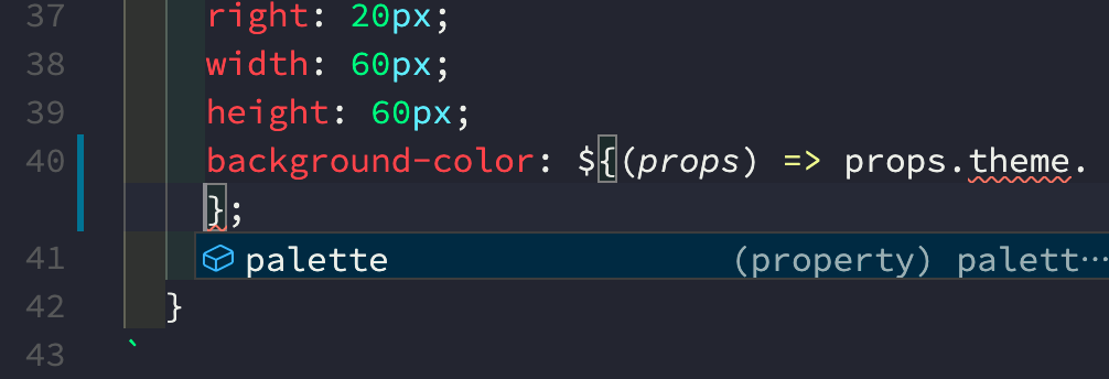
)実際に利用したい場合は下記のように参照できます。
const Iframe = styled.iframe`
  &&& {
    z-index: 2147483000;
    position: fixed;
    bottom: 20px;
    right: 20px;
    width: 60px;
    height: 60px;
    background-color: ${(props) => props.theme.palette.primary.main};
    border-radius: 50%;
  }
`
&&& はスタイルの詳細度を増すための styled-components の記法です。例えば .wrapper iframe に記述されたスタイルが既に存在していた場合、styled.iframe に記述されたスタイルより詳細度が高くなってしまいます。ここで &&& という記法を使うことにより、styled.iframe のスタイルの詳細度を高めることが可能になります。
theme の型定義
background-color: ${(props) => props.theme.palette.primary.main} ですが、参照がとても長いので、TypeScript を使うならコードヒントの恩恵を受けたいです。
src/types/styled-components.d.ts に以下の型定義を追加します。
import "styled-components"
import { theme } from "../theme"

type Theme = typeof theme

declare module "styled-components" {
  // eslint-disable-next-line @typescript-eslint/no-empty-interface
  export interface DefaultTheme extends Theme {}
}
tsconfig.json の compilerOptions.typeRoots に ["types", "node_modules/@types"] を追加し、独自の型定義をエディタが読んでくれるようにします。
無事にコードヒントが出るようになりました。